From lifestyle, sports & performance brands, to legacy, tech & music brands, we specialize in Brand Transformation.
Case Studies

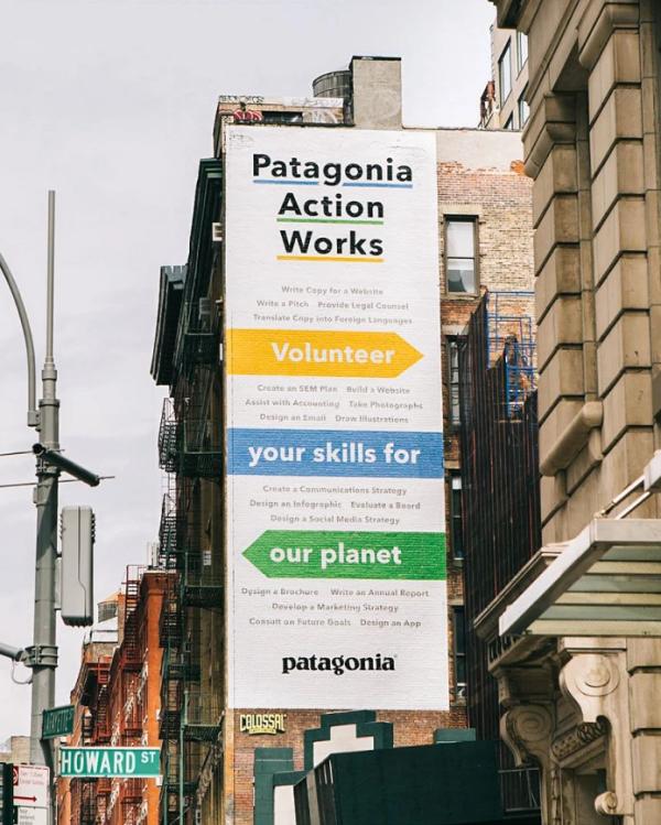
Building Patagonia an ecosystem of purpose-driven campaigns

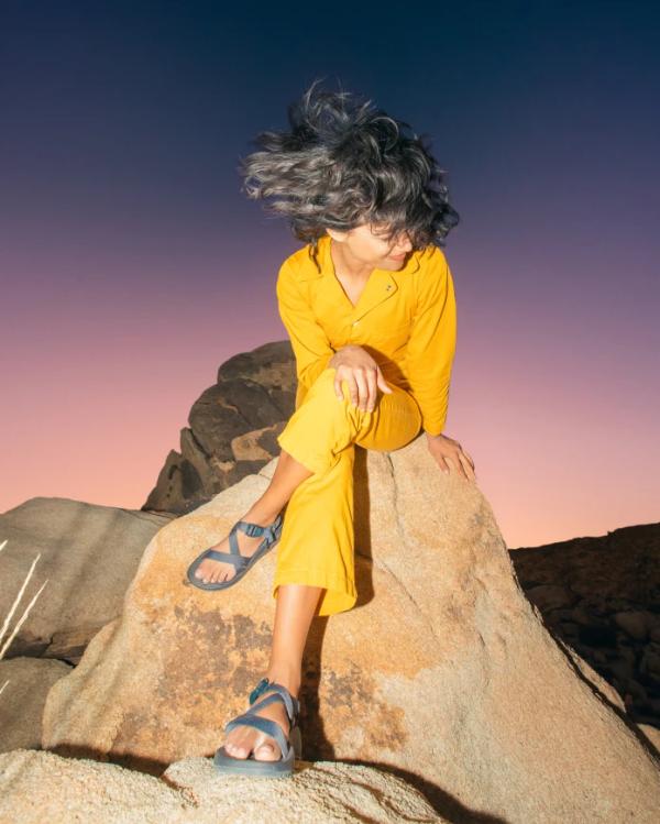
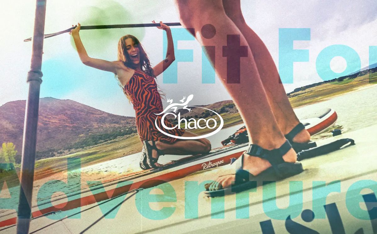
A brand refresh and campaign ecosystem to expand Chaco’s reach, resonance, and community

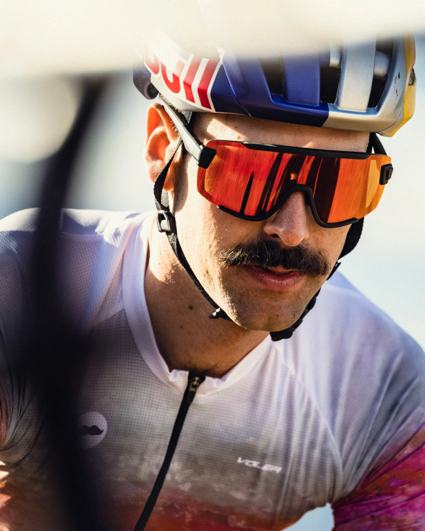
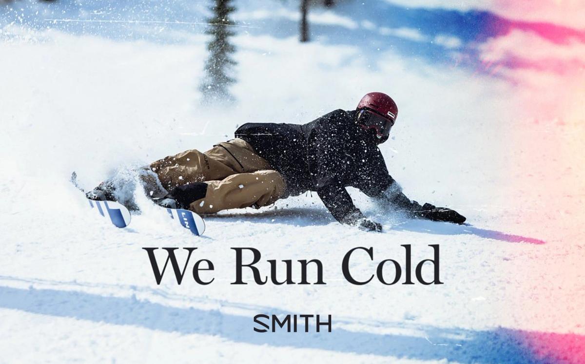
Bringing Smith Optics’ consumers closer to the action

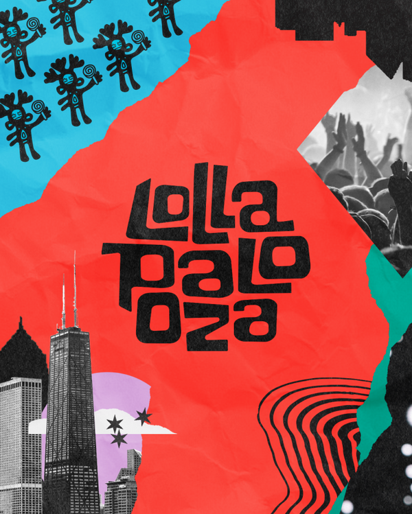
Reinventing Lollapalooza for the next generation of festival-goers

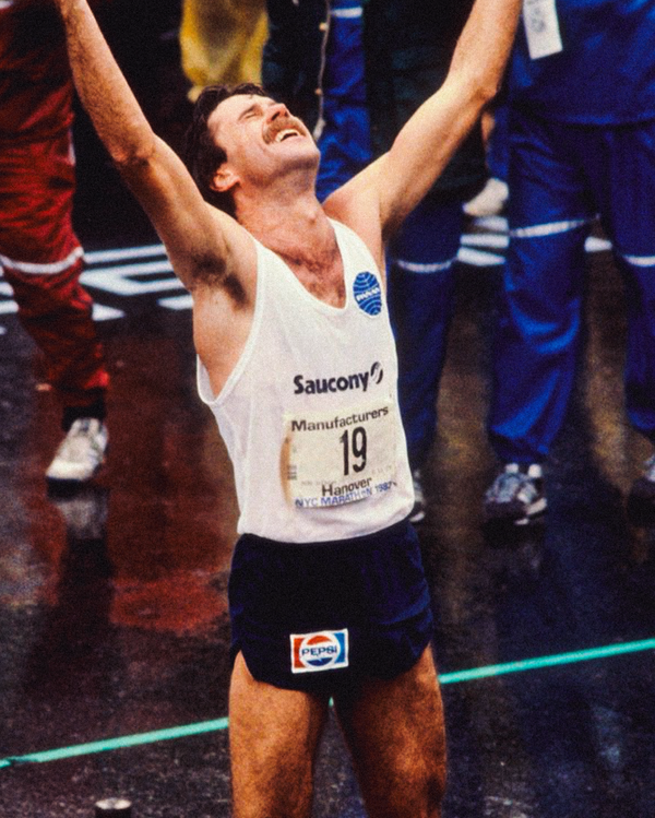
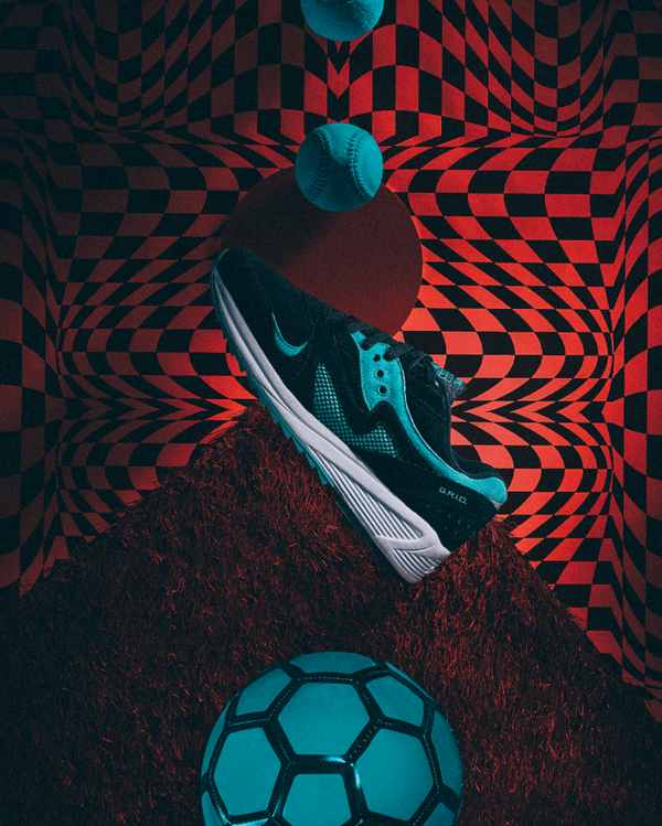
A decade of campaigns, activations and branding for Saucony

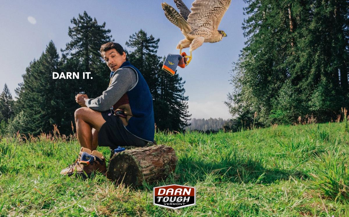
Darn Tough’s first brand campaign pushes ‘lifetime warranty’ to new extremes

Recharging an iconic ‘90s brand with new energy

Digital storytelling for Starface’s social-savvy fans

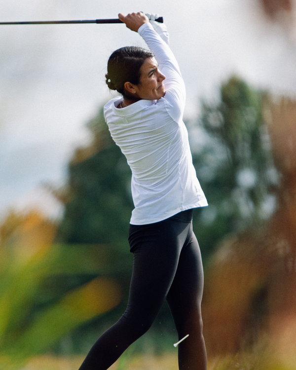
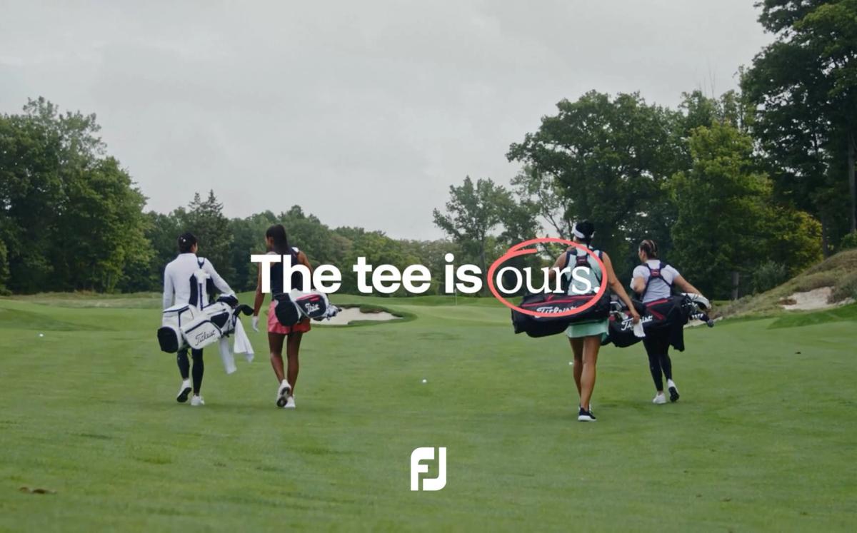
Introducing FootJoy to a whole new set of athletes

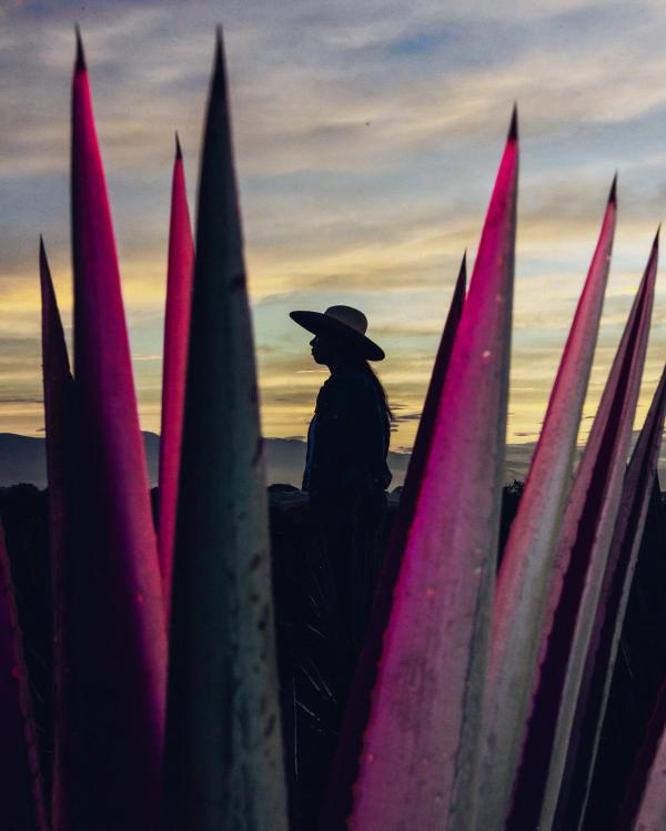
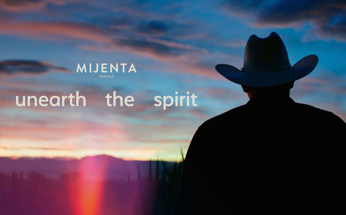
A brand campaign for Mijenta — sustainable tequila with a story to tell


A brand identity refresh and design system for Kimberly-Clark—one of the largest consumer product brands in the world

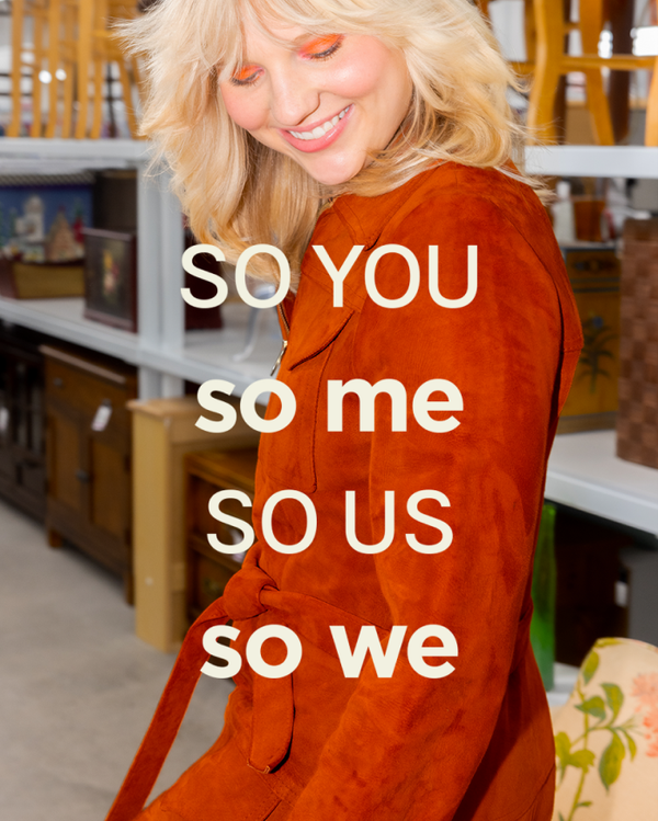
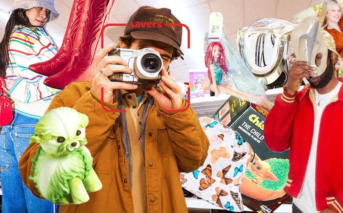
Savers brand refresh and campaigns modernize thrift for a new generation

Creative and production for Saucony Originals product drops

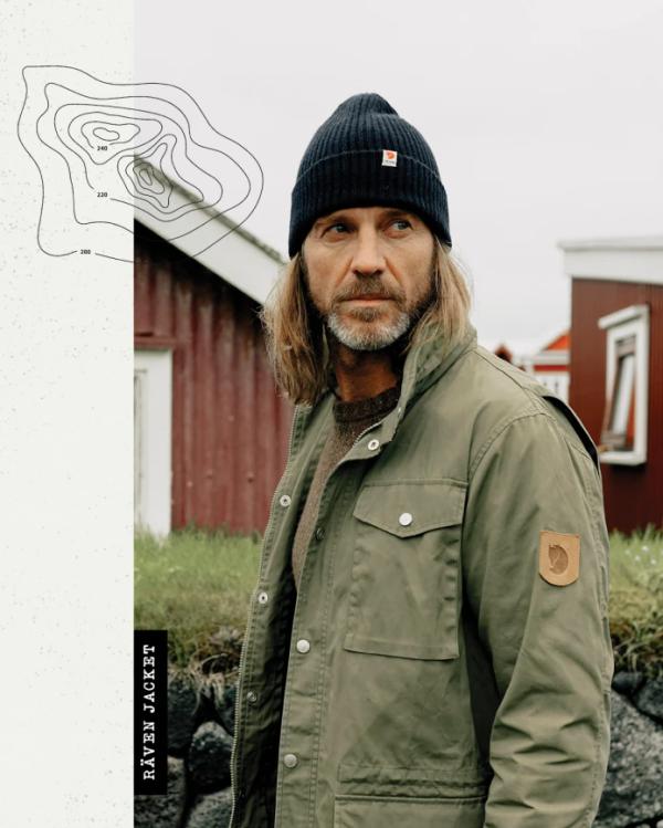
Putting Fjällräven’s environmental ethos in print

A winning playbook to reach all of Klaviyo’s audience segments


Bringing Davines’ environmental mission to the masses

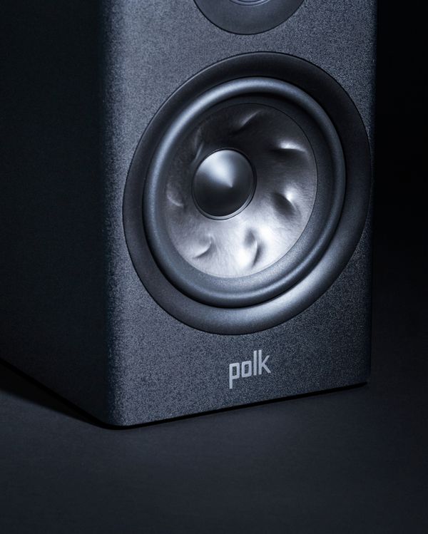
Leveraging Polk Audio’s legacy to build trust with consumers

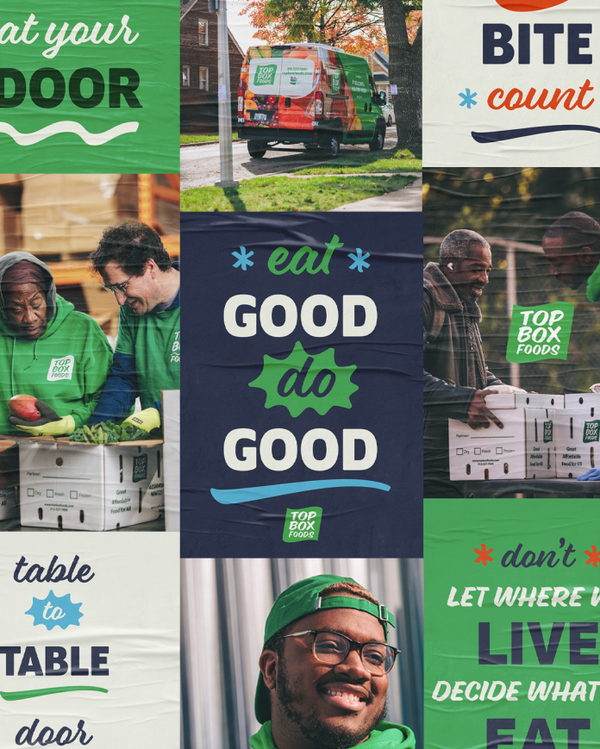
Top Box Foods brand refresh delivers purpose with clarity

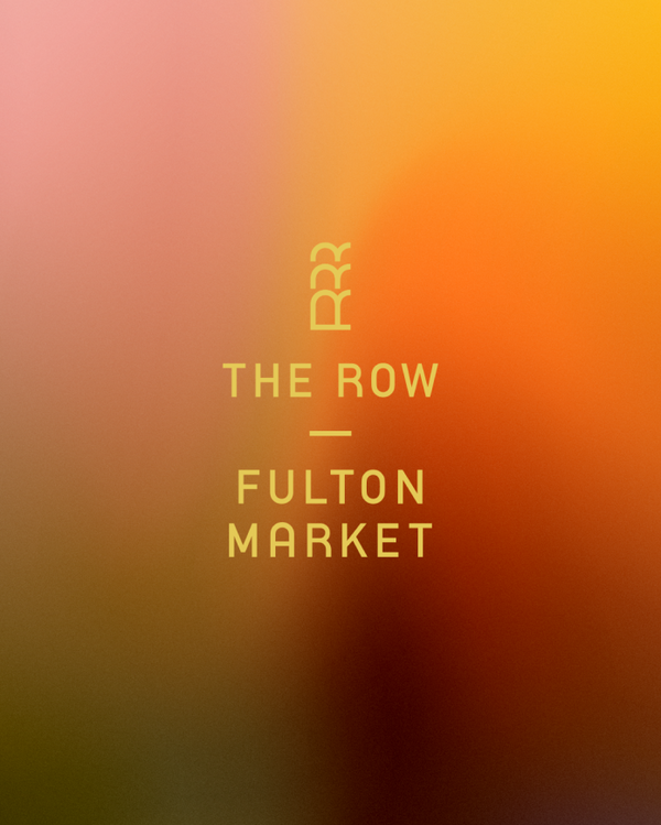
Branding The Row Fulton Market from the ground up

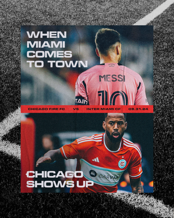
Elevating Chicago’s MLS team to world class status

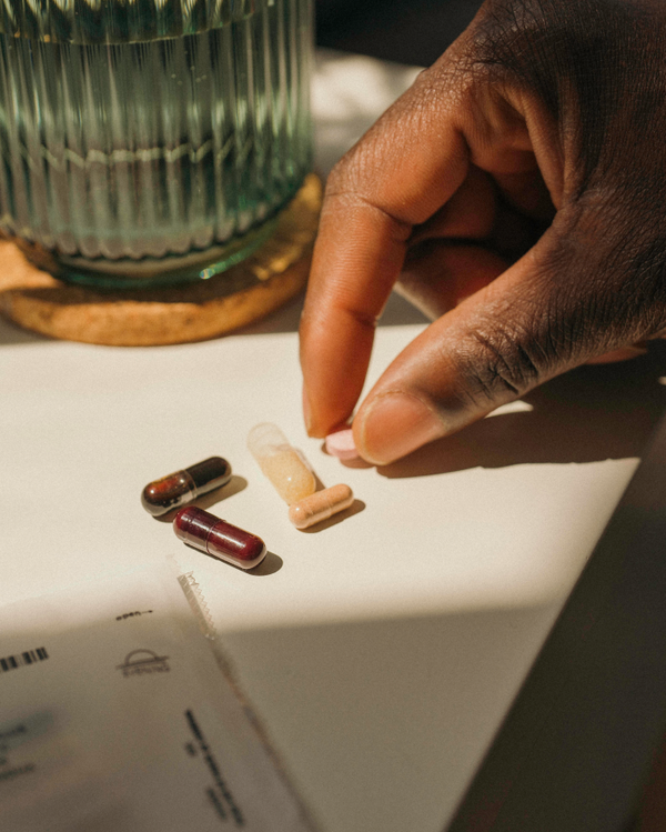
Giving D2C vitamin brand Persona an identity boost

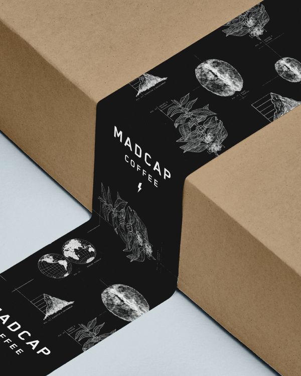
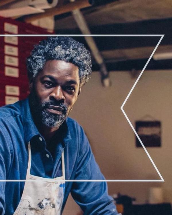
Building Madcap Coffee a robust brand for consumers with taste

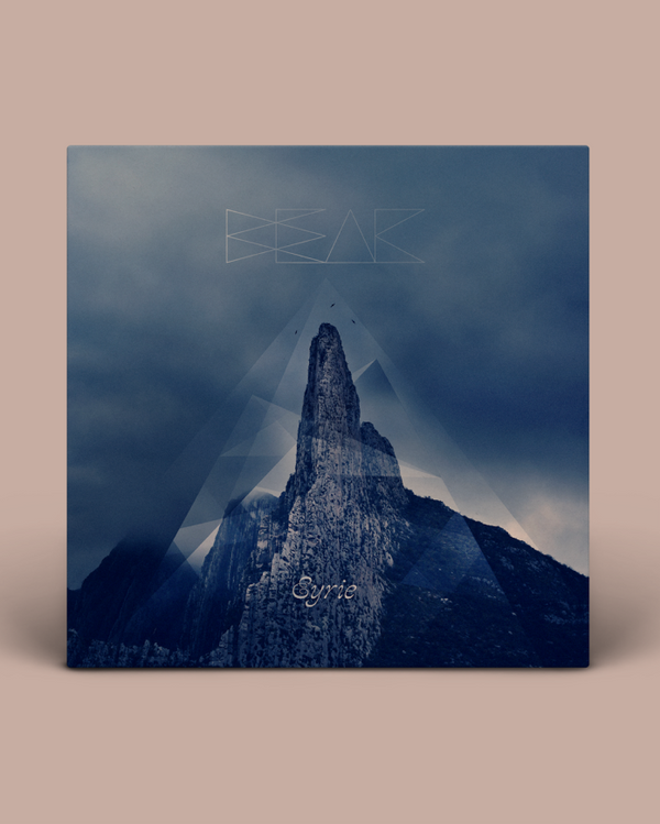
25 years of indie music design & photography
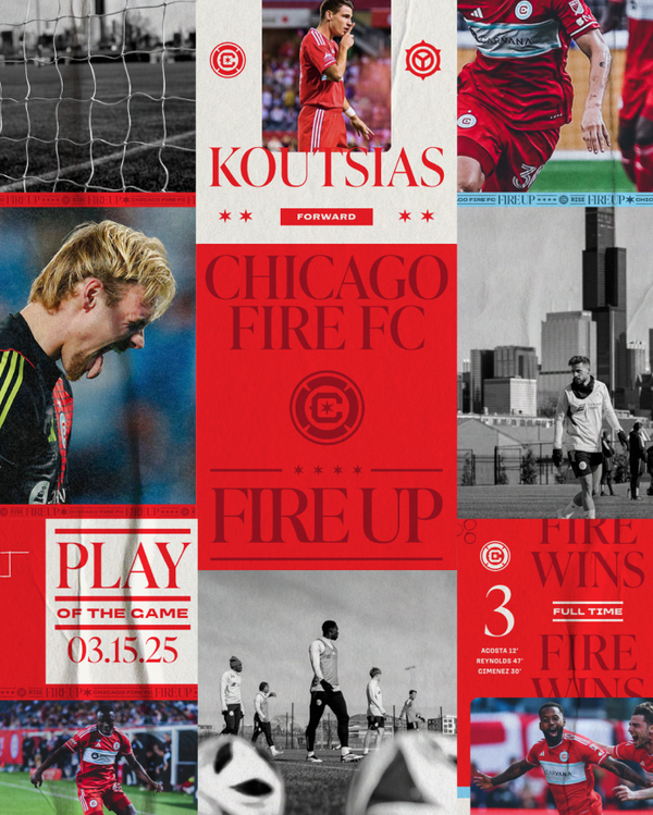
A brand refresh and rallying cry for Chicago Fire FC

Art for the people

Rebranding Figo to make pet insurance more personal

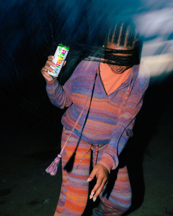
Freshie’s brand launch makes a splash

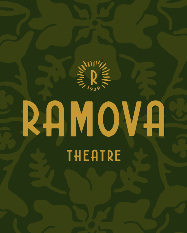
Bringing Ramova back to life with a new brand identity and design system

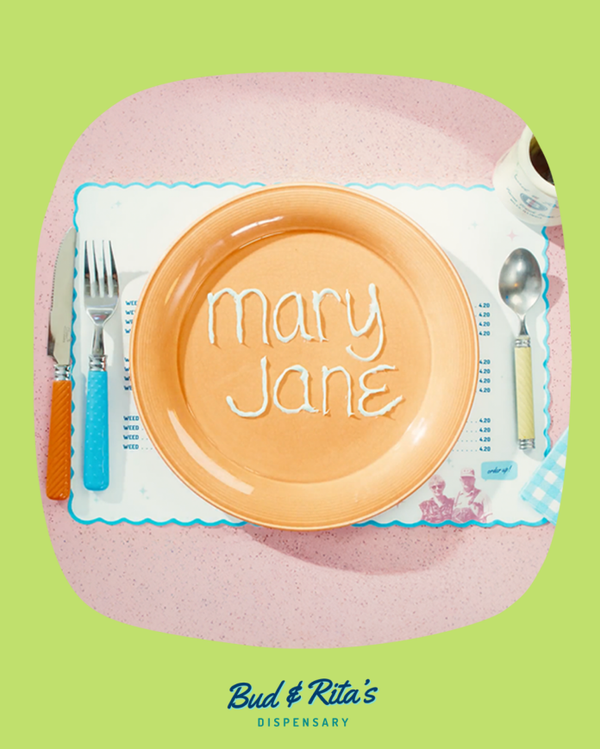
Come on in—a brand campaign for Bud & Rita’s dispensary

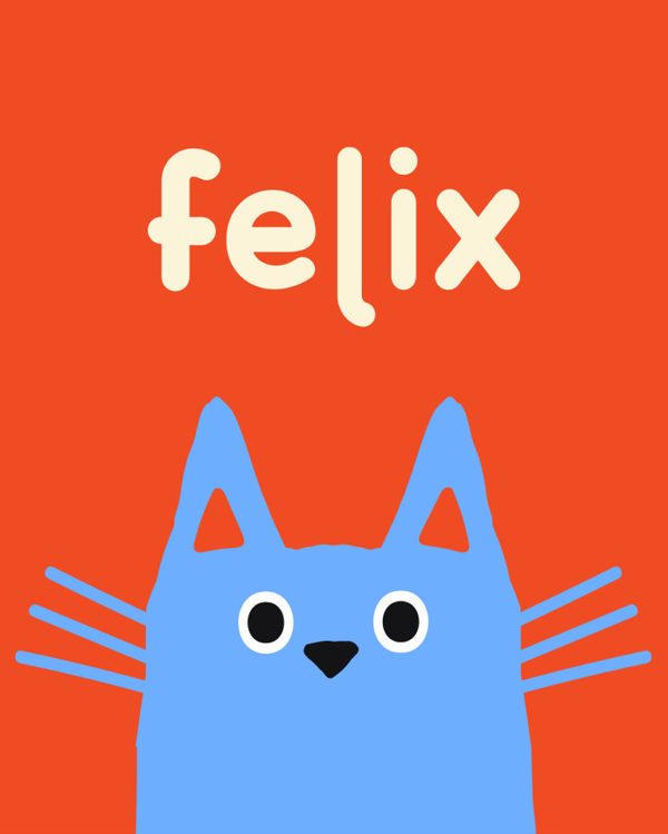
Establishing a brand identity for Felix—the only insurance just for cats

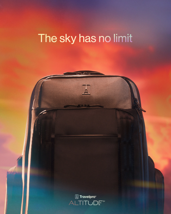
A first-class product campaign for Travelpro

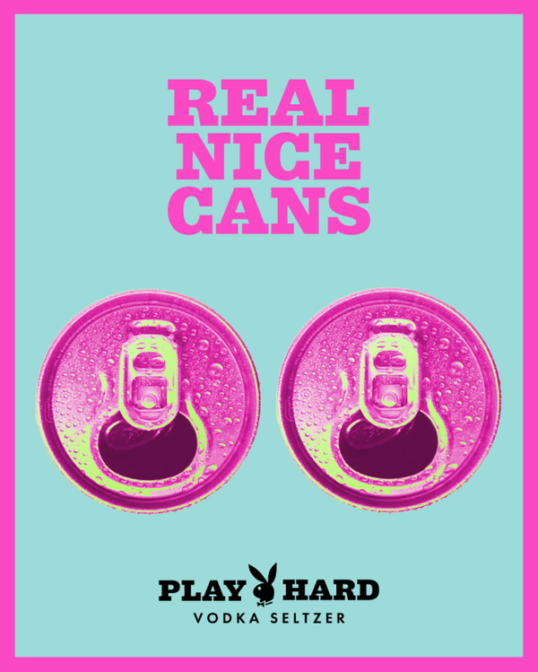
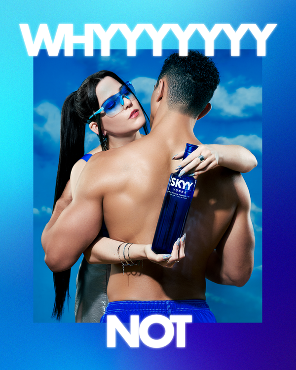
A PG-13 brand campaign for Play Hard Vodka Seltzer
SPOTS


more
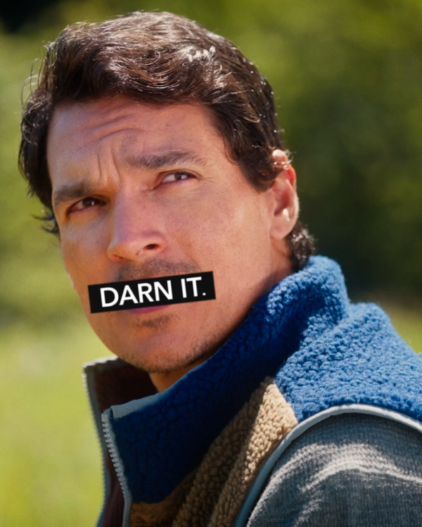
Darn Tough - Darn It
Undisputed fact of life: sometimes shit happens. And sometimes it happens to your socks. Our friends at Darn Tough make some of the best socks in the world, backed by the most aggressive lifetime guarantee we’ve ever seen (for real). Inspired by real-life stories from their customers, our lead spot is a portrait of life’s little “darn it” moments.
- Strategy
- Copywriting
- Creative Concept
- Directing
- Editing
- Production
- Post Production
Agency Director & Creative Director: Kara Hamilton Line Producer & Post Producer: Katey Meyer Production Coordinator: Abigail Lipp Editor, Sound Designer, & Post Supervisor: Ellie Hall Copywriter & Script Supervisor: Landon Groves Account Director: Ellen Evangelides ECD: Chris Eichenseer Managing Director: Annika Welander Director of Strategy: Patrick Collins Director of Client Relations: Justin Hoot
Crew Director of Photography: Taylor Russ AD: Alex Gilbert 1st AC: Mike Chan Gaffer: Cain Czopek Key Grip: Nicholas Gomez Sound: Henrique Campos Production Assistant: Louis Mischeaux Voiceover: Clint Morrison Colorist: Ben Cerauli Sound Mixer: Ben Kruse Stylists / Art Dept: Roma Oeh, Cristina Chavez, Karly Yegehiaian HMU: Jihyun Kim Talent Mikaila Maei Darlene Aniebonam Zachary Staben Micah Flamm Animal talent provided by Pawsitively Famous and West Coast Falconry